
TRB
BY NATURE
TRB
BY NATURE
TRB
BY NATURE


Project Details
Project Details
Project Details
Client Name: 1990 Magazine | Year: 2023 | Project Type: Visual Identity, PRINT DESIGN | Industry: Print Publishing
Client Name: 1990 Magazine | Year: 2023
Project Type: Visual Identity | Industry: Print Publishing
Client Name: 1990 Magazine | Year: 2023
Project Type: Visual Identity | Industry: Print Publishing
Summary
Challenges
Deliverables
Solution
"The use of a modern minimalism design captures the magazine's name and essence perfectly, bridging the rebellious energy of the 90s with today’s contemporary aesthetic. The logo is simple yet memorable, and the clean layouts allow the bold imagery and editorial content to stand out. It was a fun and amazing time working with Roshan and we plan on collaborating in the near future with him."
BRIAN BEE - CO FOUNDER OF 1990
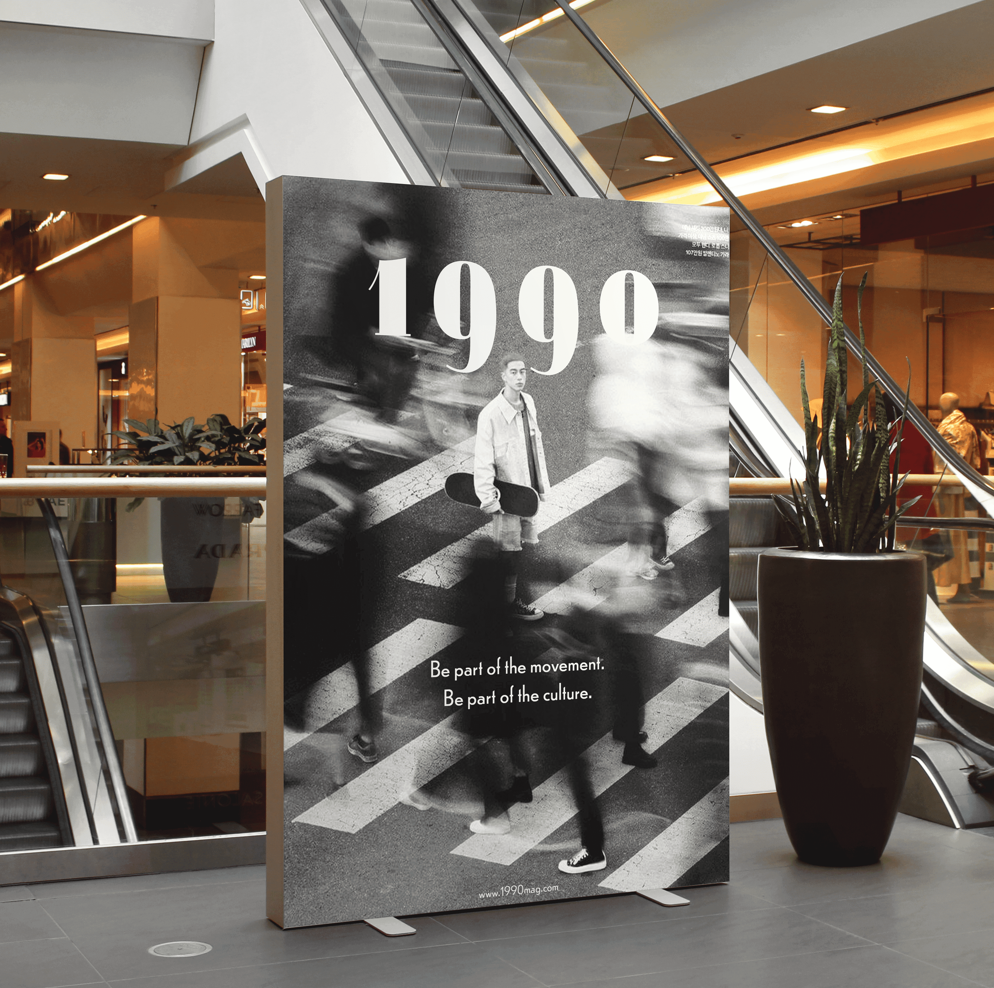
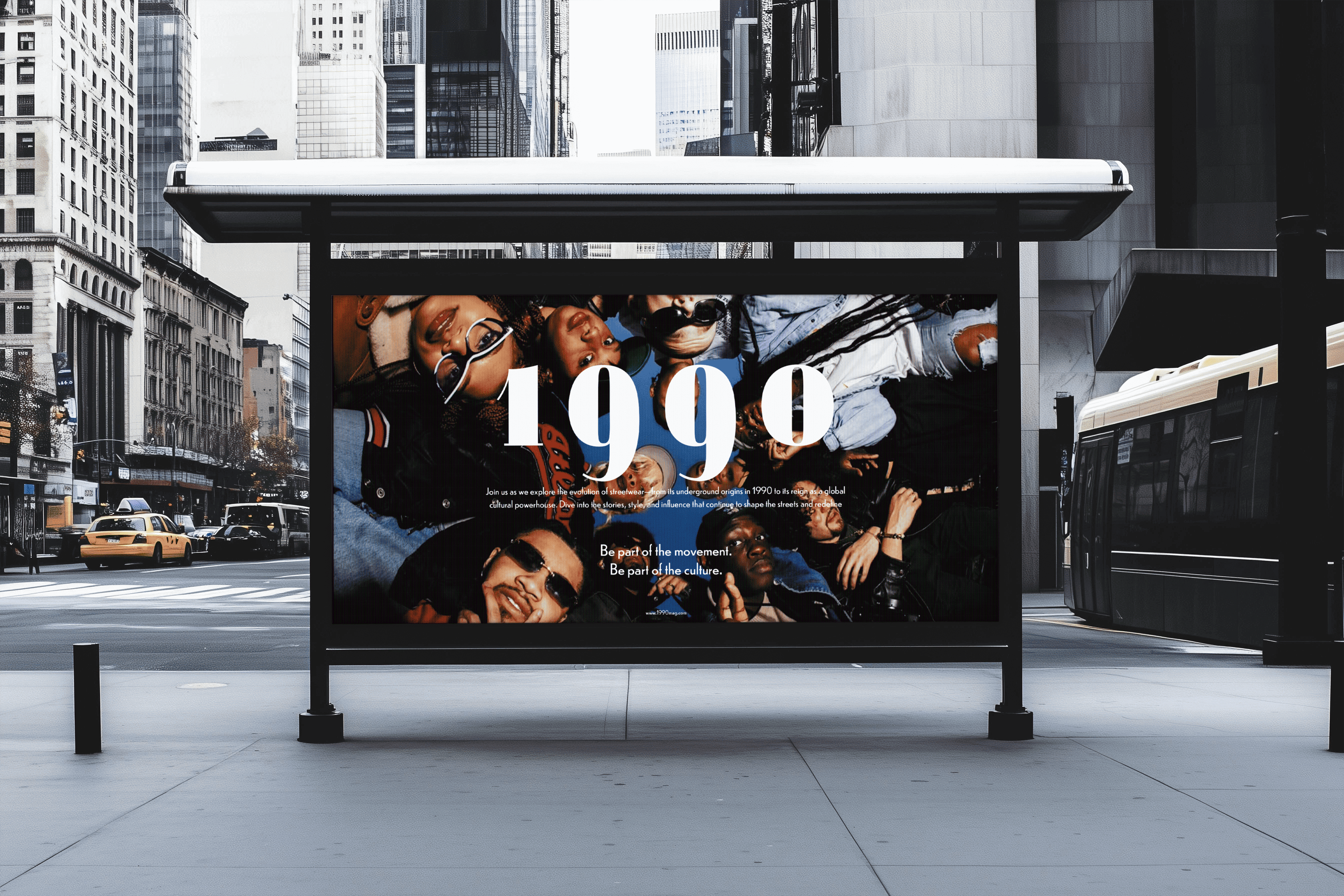
01. LOGO
01. LOGO
01. LOGO
CREATING A TIMELESS
& CLASSIC LOGO.
CREATING A TIMELESS & CLASSIC LOGO.
CREATING A TIMELESS & CLASSIC LOGO.

The logo features a customized Jeanne Mondero OT.
The distinctive descender of the nine adds boldness
and ensures visibility against any backdrop.
The logo features a customized Jeanne Mondero OT.
The distinctive descender of the nine adds boldness
and ensures visibility against any backdrop.


When To Use Light & Heavy Weight
When To Use Light & Heavy Weight
When To Use Light & Heavy Weight
Depending on the cover format, two distinct weights are used. A lightweight is used for a vertical title cover, and a thicker weight is used for a horizontal title cover.
Depending on the cover format, two distinct weights are used. A lightweight is used for a vertical title cover, and a thicker weight is used for a horizontal title cover.


02. FONT PAIRING
02. FONT PAIRING
CLEAN, GEOMETRIC & TIMELESS.
CLEAN, GEOMETRIC & TIMELESS.
CLEAN, GEOMETRIC & TIMELESS.
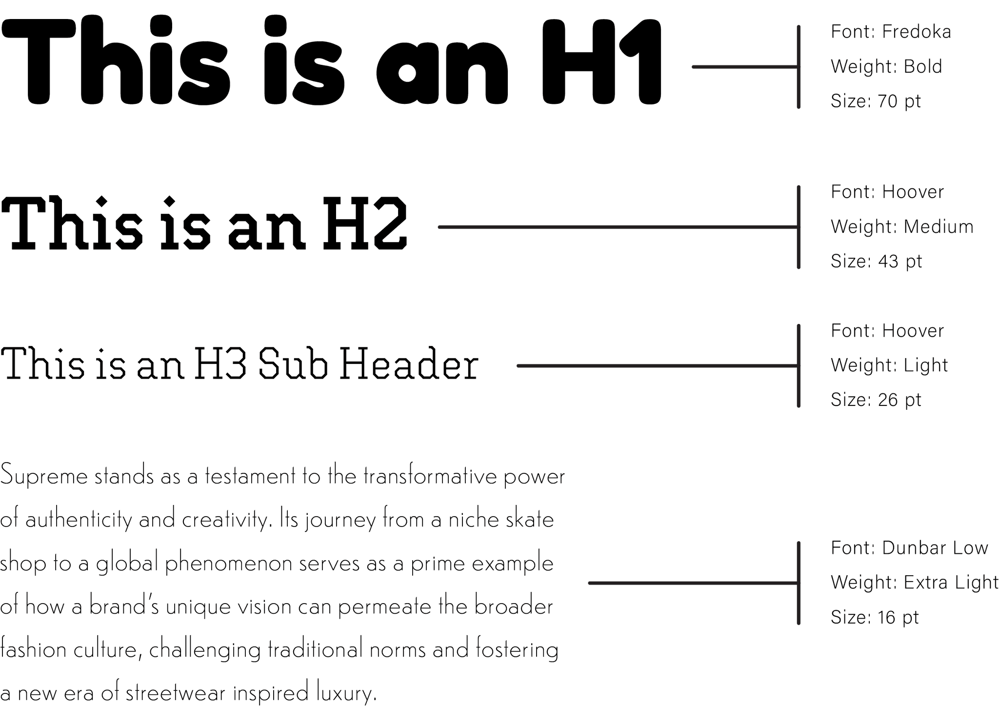
How to Use
The System
How to Use The System
How to Use
The System
The font size is determined using the 1.618 ratio system.
Start by selecting the base font size for the body text, 16pt in this example. Then, multiply it by 1.618 to determine the next size. You can round up or down, using your eye to judge what looks best.
This system works well for several reasons. First, it's simple to teach and easy to understand, allowing teams to align quickly. Second, it creates a clear visual hierarchy.
The font size is determined using the 1.618 ratio system. Start by selecting the base font size for the body text, 16pt in this example. Then, multiply it by 1.618 to determine the next size. You can round up or down, using your eye to judge what looks best.
This system works well for several reasons. First, it's simple to teach and easy to understand, allowing teams to align quickly. Second, it creates a clear visual hierarchy, making it easy to distinguish between headers and subheaders.


02. COLOR
02. COLOR
02. COLOR
DOLD 90'S
INSPIRED COLORS
DOLD 90'S
INSPIRED COLORS
DOLD 90S
INSPIRED COLORS

Primary
Secondary

Primary
Secondary
Primary
Secondary
More Projects
More Projects
More Projects

