
TRB
BY NATURE
TRB
BY NATURE
TRB
BY NATURE


PROJECT DETAILS
PROJECT DETAILS
PROJECT DETAILS
Client name: Neura Nova Cannabis Club | Year: 2024 | Project type: visual identity, web design | Industry: Cannabis Industry
Client name: Neura Nova Cannabis Club | Country: Canada | Year: 2024
Project type: visual identity | Industry: Cannabis Market
Client name: Neura Nova Cannabis Club | Year: 2024 | Project type: visual identity
Industry: Cannabis Industry
Summary
Deliverables
Development
Summary
Deliverables
Development
Summary
Deliverables
Development
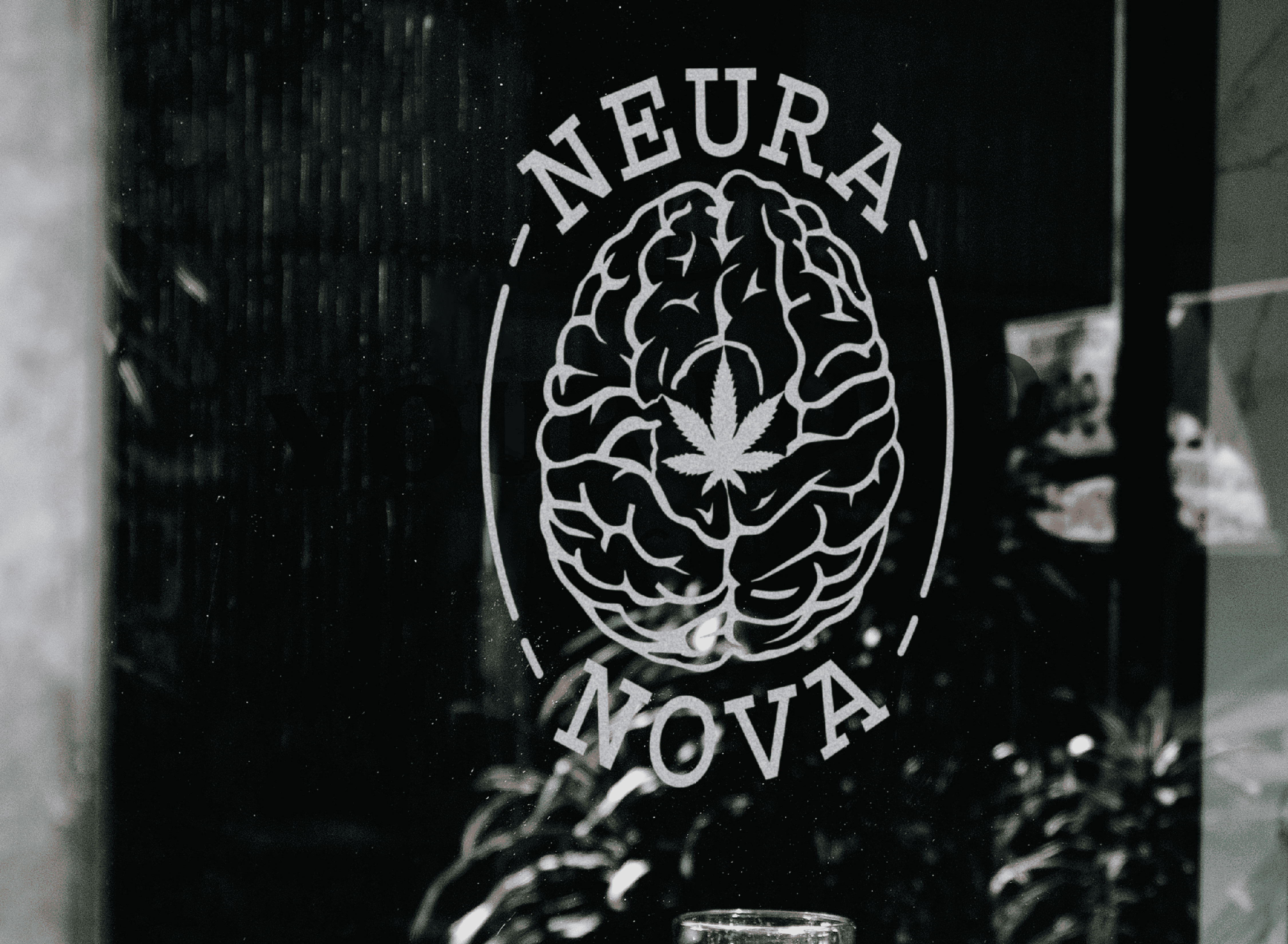
01. LOGO
01. LOGO
01. LOGO
SIMPLIFIED WITHOUT LOSING PERSONILITY
SIMPLIFIED WITHOUT LOSING PERSONILITY
SIMPLIFIED WITHOUT LOSING PERSONILITY


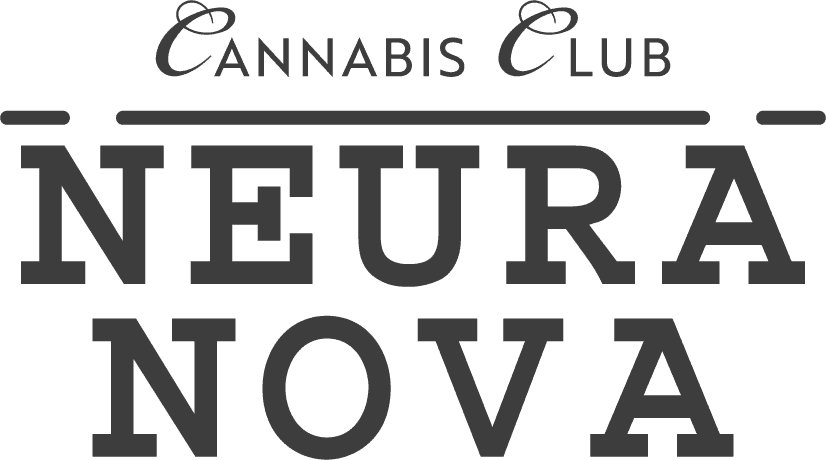
STACKED
WORDMARK
STACKED
WORDMARK
STACKED
WORDMARK
HORIZONTAL
WORDMARK
HORIZONTAL
WORDMARK
HORIZONTAL
WORDMARK

Design Theory
Font Choice


Design Theory
Font Choice
Design Theory
Font Choice
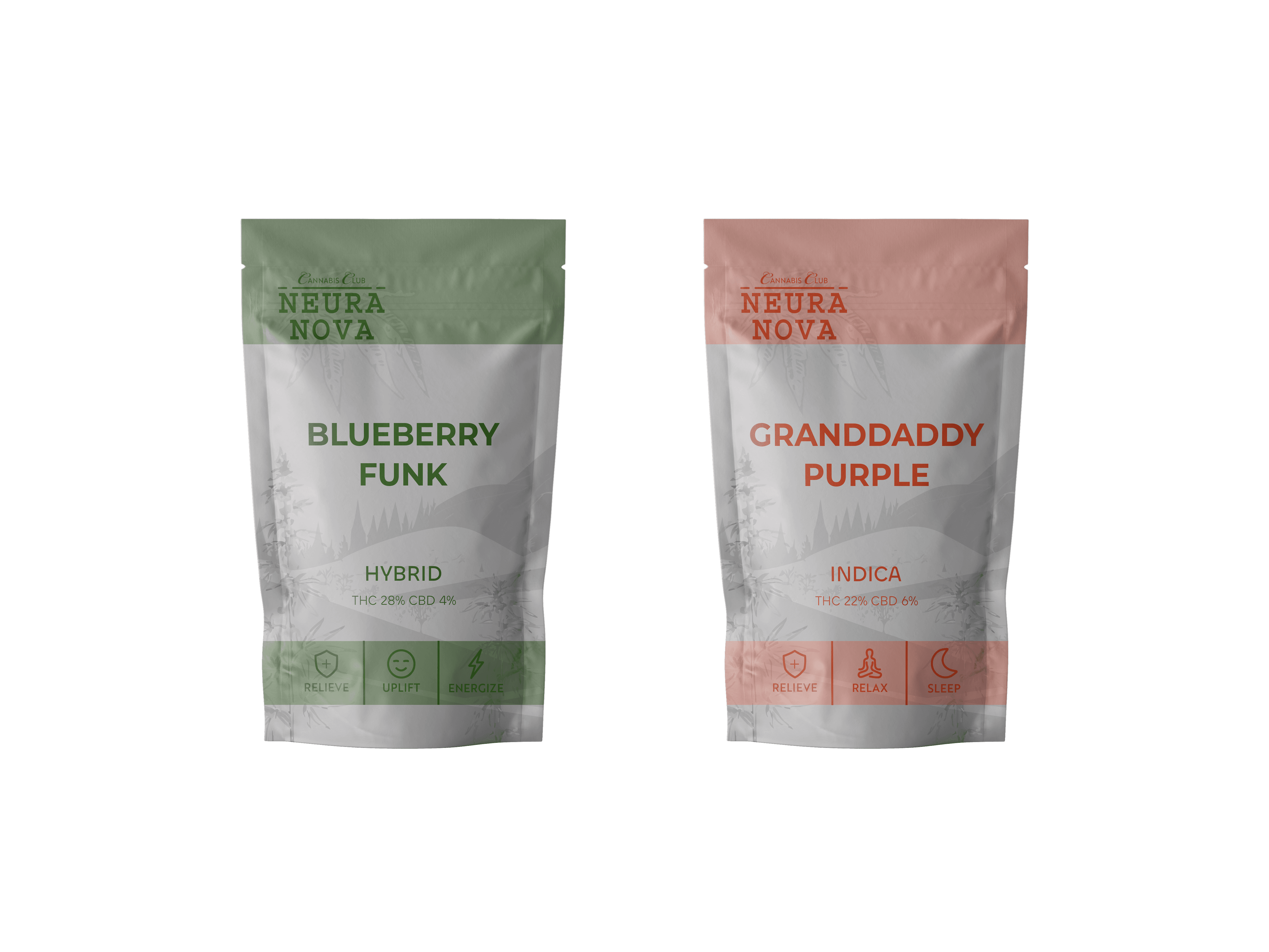
02. COLOR
02. COLOR
02. COLOR
REFLECTIVE OF CORE VALUES
REFLECTIVE OF CORE VALUES
REFLECTIVE OF CORE VALUES

#bf2b0a
(191, 43, 10)
(17, 95, 100, 8)
#bf2b0a
(191, 43, 10)
(17, 95, 100, 8)
#bf2b0a
(191, 43, 10)
(17, 95, 100, 8)
Orange, a vibrant and energetic colour, embodies enthusiasm and creativity for a cannabis company. It symbolizes a dynamic approach to cannabis education, showcasing a commitment to continuous innovation, staying informed, and sharing knowledge with the community.
Orange, a vibrant and energetic colour, embodies enthusiasm and creativity for a cannabis company. It symbolizes a dynamic approach to cannabis education, showcasing a commitment to continuous innovation, staying informed, and sharing knowledge with the community.
Orange, a vibrant and energetic colour, embodies enthusiasm and creativity for a cannabis company.
It symbolizes a dynamic approach to cannabis education, showcasing a commitment to continuous innovation, staying informed and sharing knowledge with the community.

#24520d
(36, 82, 13)
(82, 42, 100, 42)
#24520d
(36, 82, 13)
(82, 42, 100, 42)
#24520d
(36, 82, 13)
(82, 42, 100, 42)
Green, a symbol of nature, signifies a commitment to natural wellness in the cannabis industry, emphasizing organic cultivation and sustainable practices. It reflects a dedication to providing all natural cannabis products through environmentally conscious approaches.
Green, a symbol of nature, signifies a commitment to natural wellness in the cannabis industry, emphasizing organic cultivation and sustainable practices. It reflects a dedication to providing all natural cannabis products through environmentally conscious approaches.
Green, a symbol of nature, signifies a commitment to natural wellness in the cannabis industry, emphasizing organic cultivation and sustainable
practices. It reflects a dedication to providing all natural cannabis products through an environmentally conscious approaches.

#bdbfbf
(189, 191, 191)
(26, 20, 20.0)
#bdbfbf
(189, 191, 191)
(26, 20, 20.0)
#bdbfbf
(189, 191, 191)
(26, 20, 20.0)
Grey symbolizes transparency, embodying neutrality and balance
to convey openness and honesty in a cannabis company’s operations.
Its neutral tone signifies a commitment to unbiased practices,
emphasizing clarity in sourcing and product information.
Grey symbolizes transparency, embodying neutrality and balance to convey openness and honesty in a cannabis company’s operations. Its neutral tone signifies a commitment to unbiased practices, emphasizing clarity in sourcing and product information.
Grey symbolizes transparency, embodying neutrality
and balance to convey openness and honesty in a
cannabis company’s operations. Its neutral tone signifies
a commitment to unbiased practices, emphasizing clarity
in sourcing and product information.
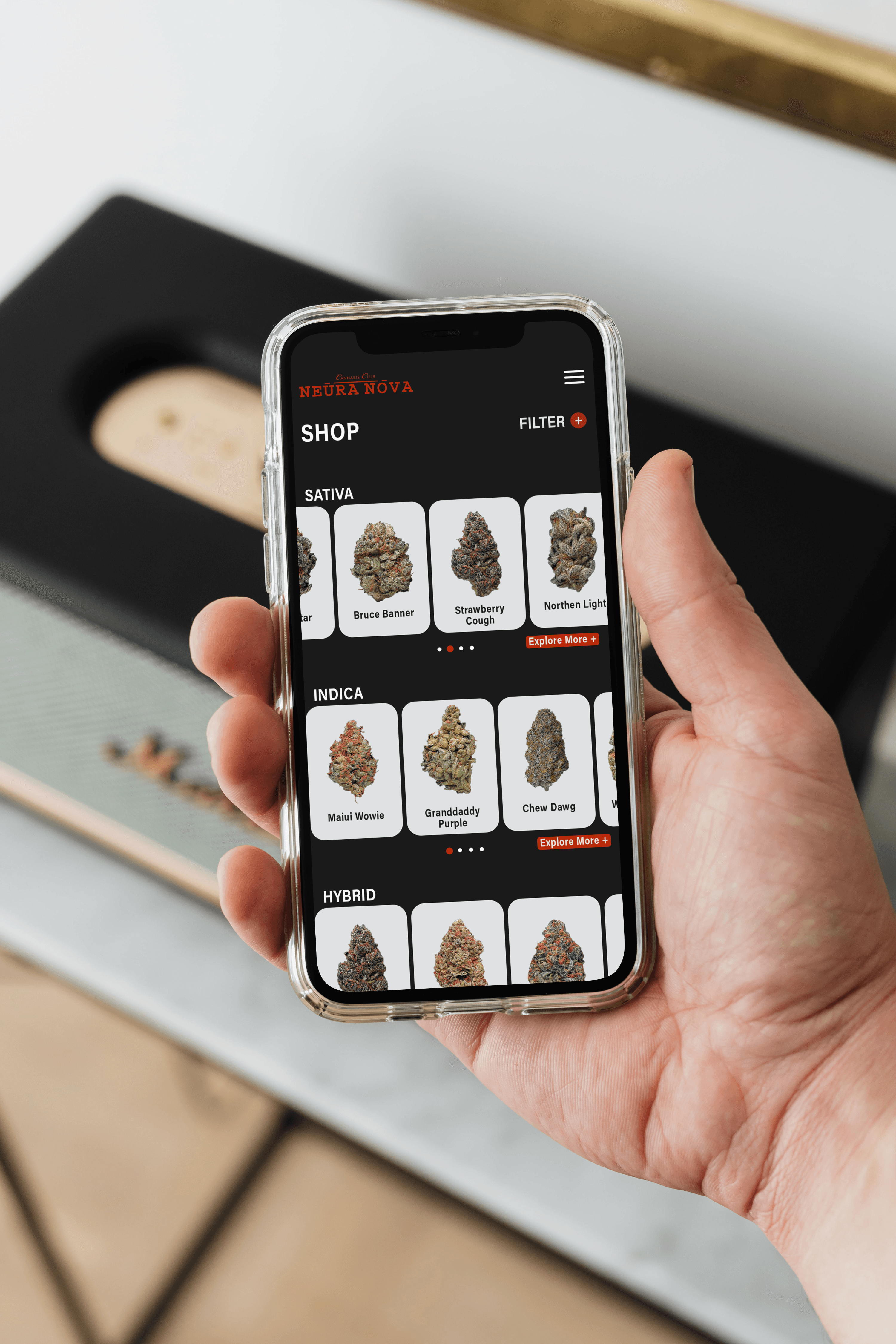
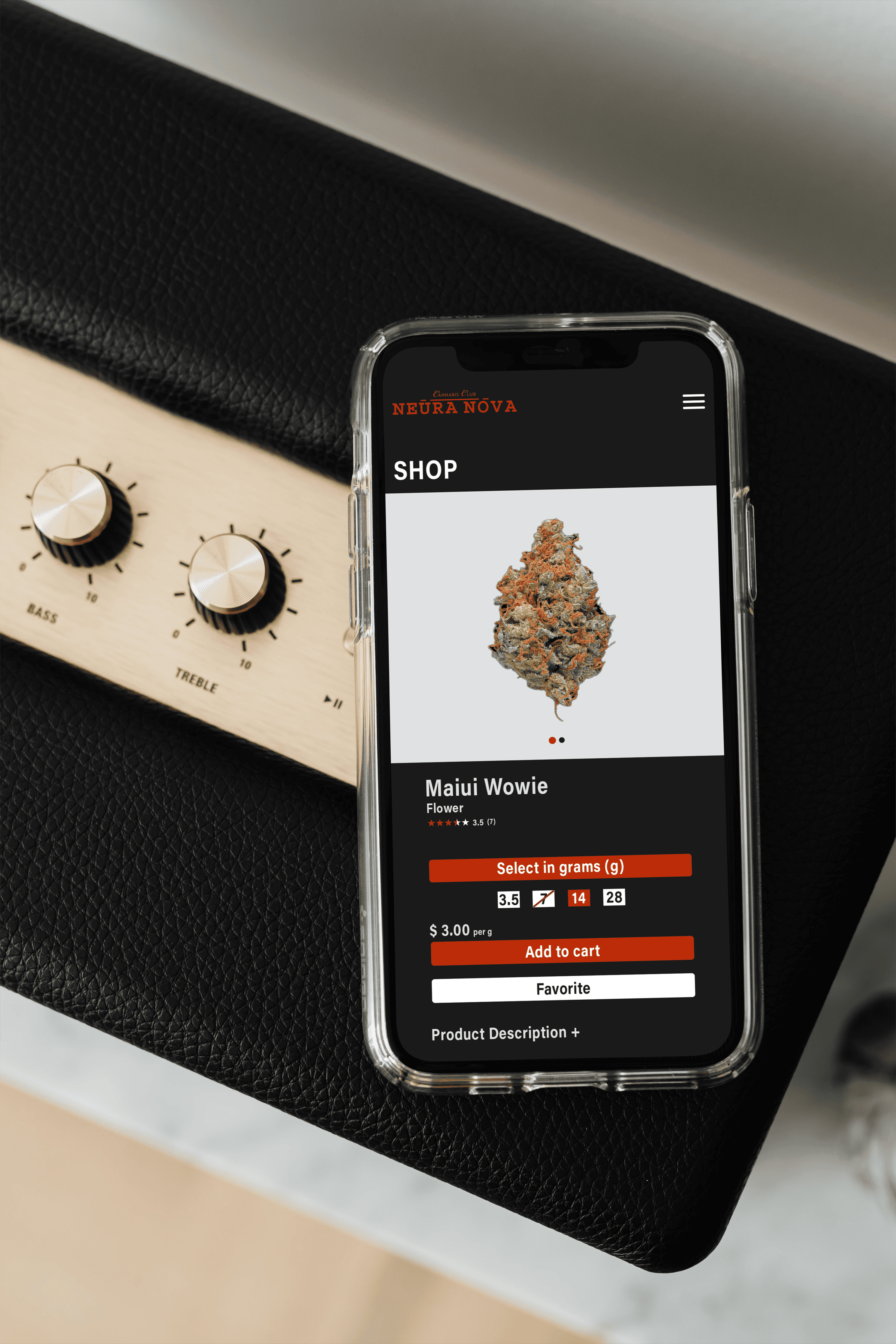
03. WEB & PHONE DESIGN
03. WEB & PHONE DESIGN
03. WEB & PHONE DESIGN
BOLD & USER FRIENDLY
BOLD & USER FRIENDLY
BOLD & USER FRIENDLY

More Projects
More Projects
More Projects

