
TRB
BY NATURE
TRB
BY NATURE
TRB
BY NATURE


PROJECT DETAILS
PROJECT DETAILS
PROJECT DETAILS
Client name: STARTOS INC | Year: 2025 | Project type: web design | Industry: Industrial Machinery/Products
Client name: STARTOS INC | Year: 2025 | Project type: web design | Industry: Industrial Machinery/Products
Client name: STARTOS INC | Year: 2025 | Project type: web design | Industry: Industrial Machinery/Products
Summary
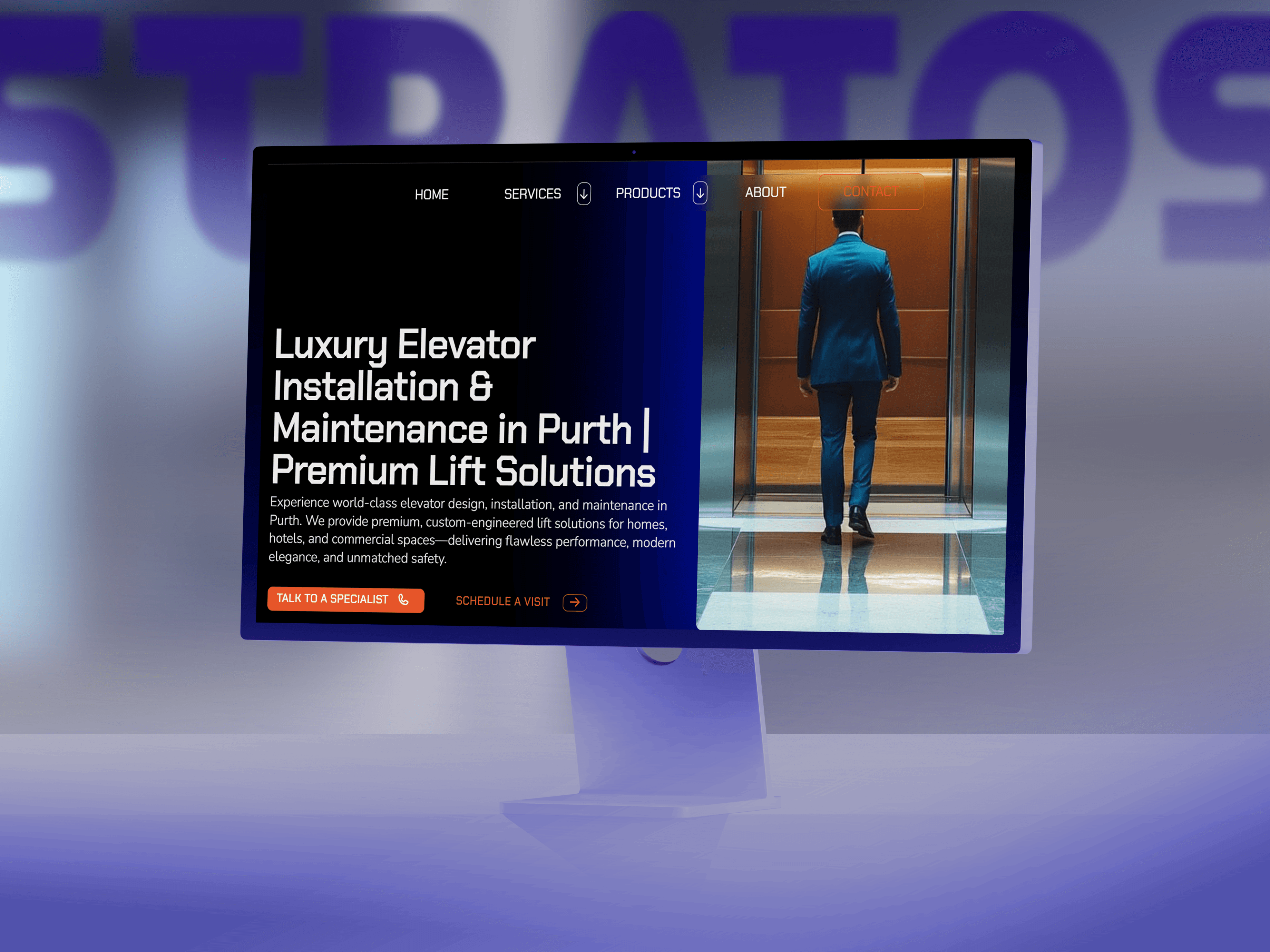
Stratos is a Sydney-based company that designs and builds elevators, and also provides installation and maintenance services. Their brand focuses on safety while maintaining a high standard of quality and luxury.
Summary
Stratos is a Sydney-based company that designs and builds elevators, and also provides installation and maintenance services. Their brand focuses on safety while maintaining a high standard of quality and luxury.
Summary
Stratos is a Sydney-based company that designs and builds elevators, and also provides installation and maintenance services. Their brand focuses on safety while maintaining a high standard of quality and luxury.
Solutions
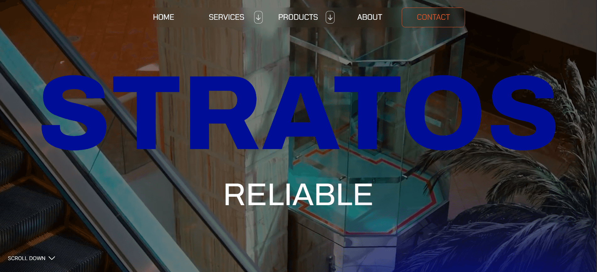
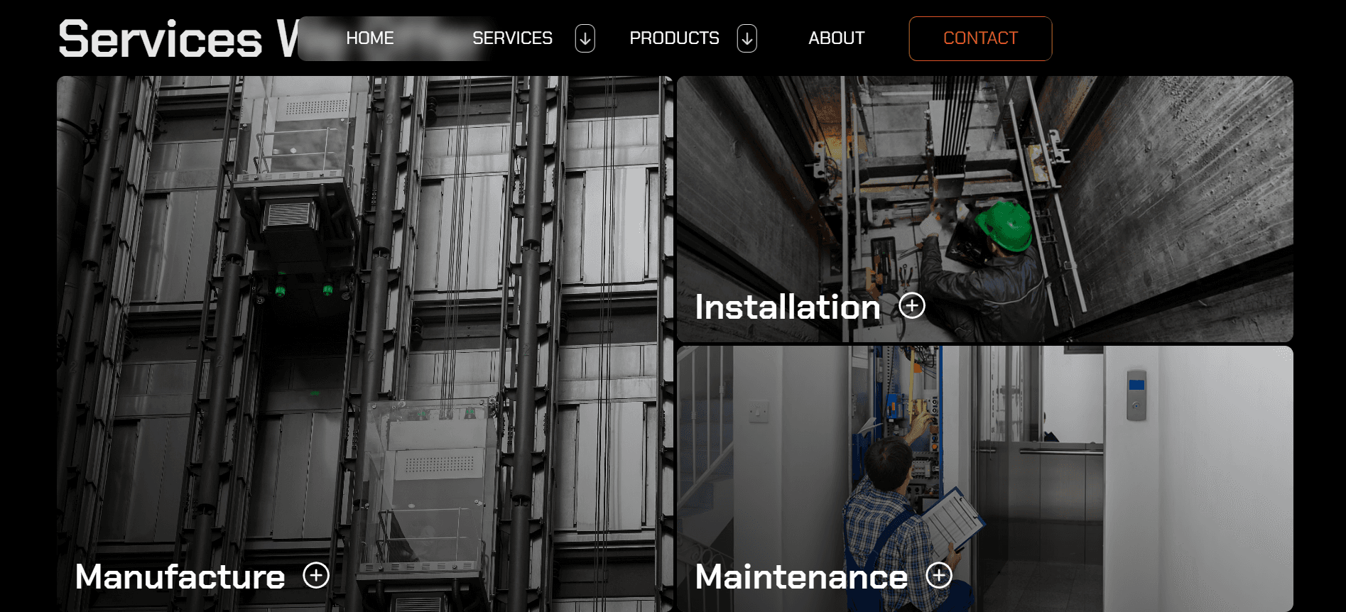
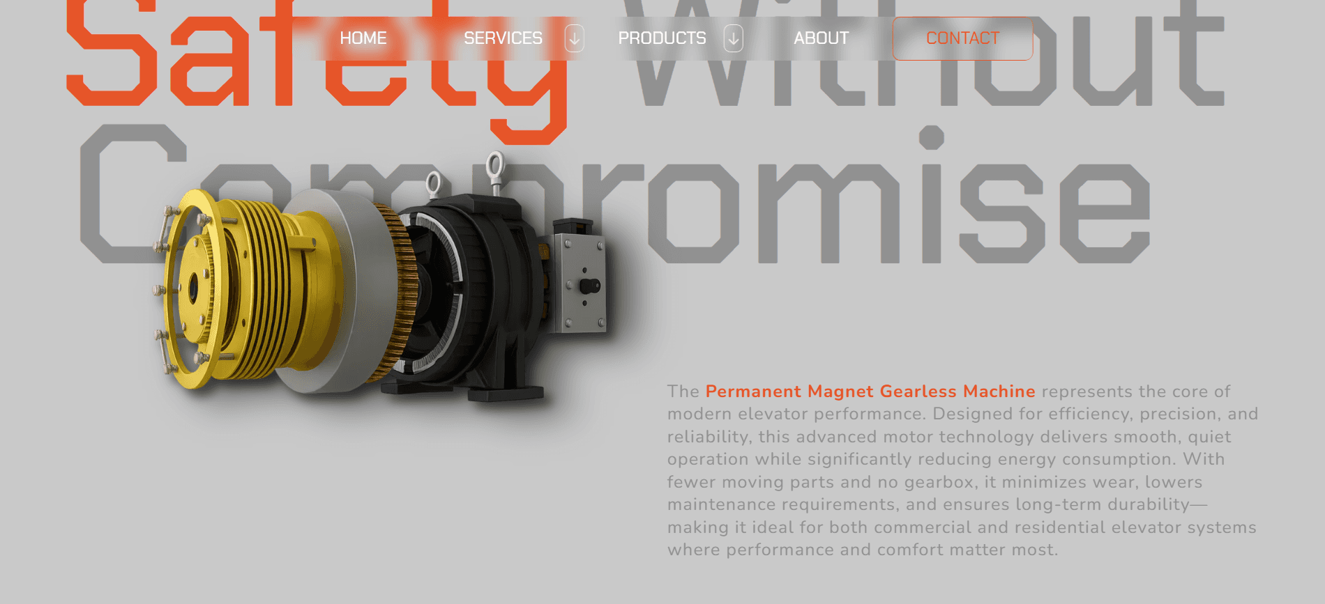
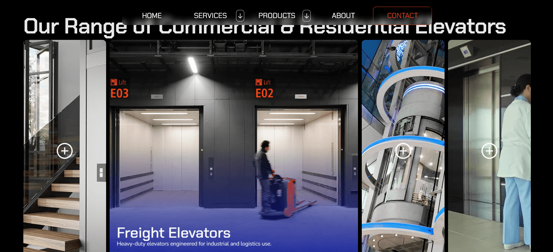
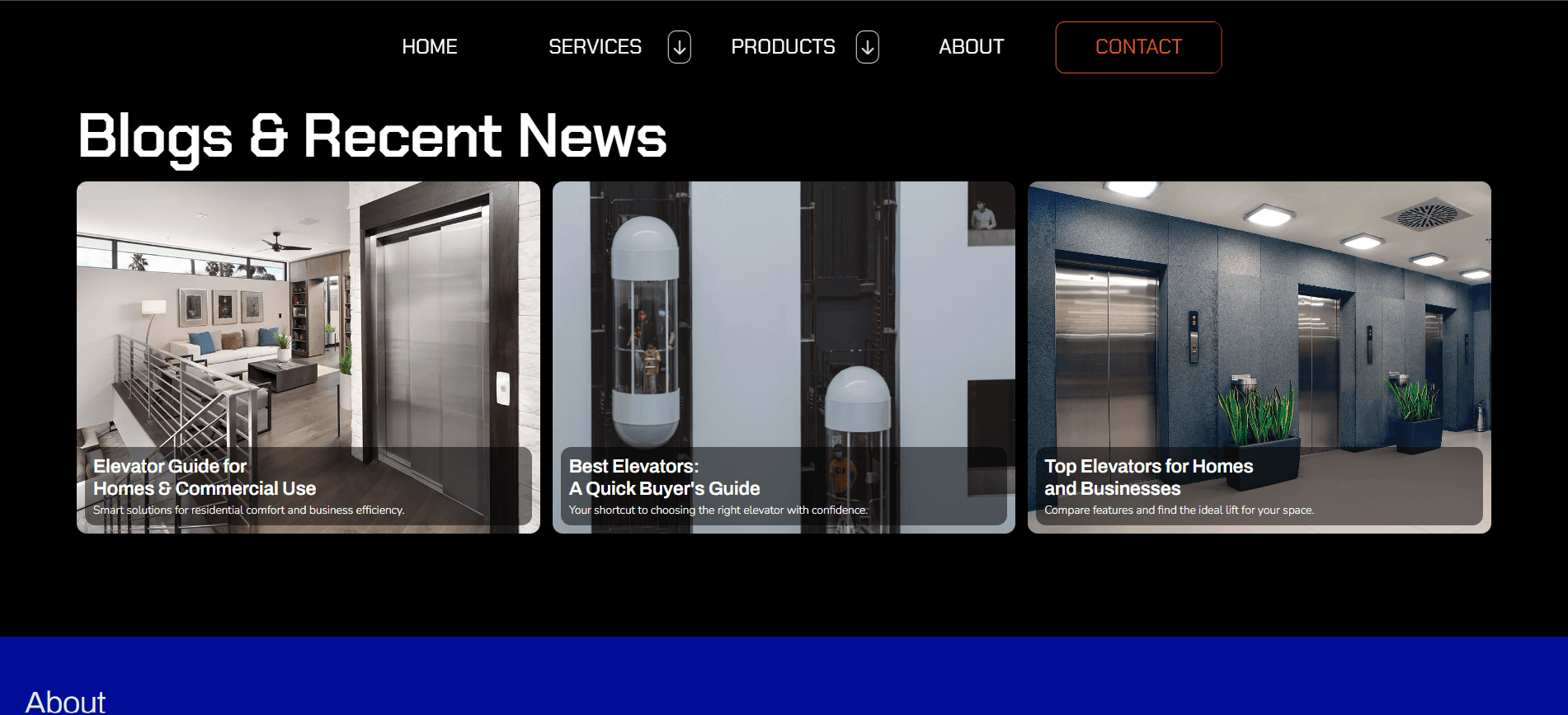
An image-focused site helps customers understand what the company does at a glance. Smooth movement and interactions between sections and images guides them to the text for more details, while clear call-to-action buttons encourage quick responses.
Solutions
An image-focused site helps customers understand what the company does at a glance. Smooth movement and interactions between sections and images guides them to the text for more details, while clear call-to-action buttons encourage quick responses.
Solutions
An image-focused site helps customers understand what the company does at a glance. Smooth movement and interactions between sections and images guides them to the text for more details, while clear call-to-action buttons encourage quick responses.
Challenges
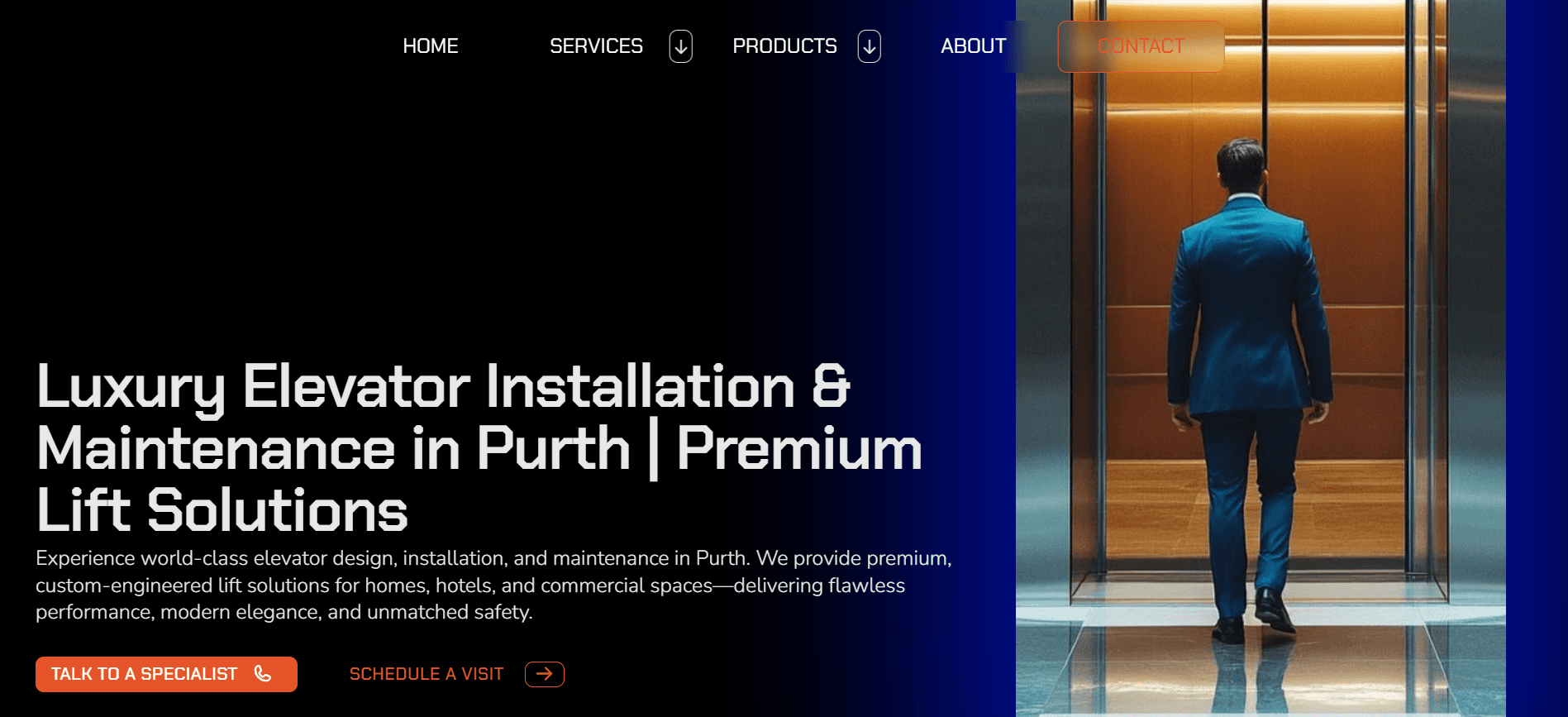
Redesiging the homepage to make it easy for existing customers to contact the company for maintenance, and for new customers to quickly understand the services offered and speak with someone right away. The main goal was to guide visitors to contact the company or book an appointment as quickly as possible.
VISUAL IDENTITY
Challenges
Redesiging the homepage to make it easy for existing customers to contact the company for maintenance, and for new customers to quickly understand the services offered and speak with someone right away. The main goal was to guide visitors to contact the company or book an appointment as quickly as possible.
Challenges
Redesiging the homepage to make it easy for existing customers to contact the company for maintenance, and for new customers to quickly understand the services offered and speak with someone right away. The main goal was to guide visitors to contact the company or book an appointment as quickly as possible.
01. COLORS
01. COLORS
01. COLORS
141414
141414
000D96
000D96
E65529
E65529
Using the company’s black and blue colors made it simple to create a default dark mode. Our choice of orange was added as an accent color to draw attention to key areas, mainly the call-to-action buttons.
Using the company’s black and blue colors made it simple to create a default dark mode. Our choice of orange was added as an accent color to draw attention to key areas, mainly the call-to-action buttons.
Using the company’s black and blue colors made it simple to create a default dark mode. Our choice of orange was added as an accent color to draw attention to key areas, mainly the call-to-action buttons.
02. TYPEFACE
02. TYPEFACE
02. TYPEFACE
Headings & Subheadings: Chakra Petch
Headings & Subheadings: Chakra Petch
Headings & Subheadings: Chakra Petch
Body:
Nunito
Body:
Nunito
Body:
Nunito
Buttons:
Chakra Petch
Buttons:
Chakra Petch
Buttons:
Chakra Petch
The Chakra Petch typeface establishes a clear hierarchy between headings and body copy. Medium and semi-bold weights were used for headings and subheadings, balancing readability with subtlety on an image-driven layout.
The Chakra Petch typeface establishes a clear hierarchy between headings and body copy. Medium and semi-bold weights were used for headings and subheadings, balancing readability with subtlety on an image-driven layout.
The Chakra Petch typeface establishes a clear hierarchy between headings and body copy. Medium and semi-bold weights were used for headings and subheadings, balancing readability with subtlety on an image-driven layout.
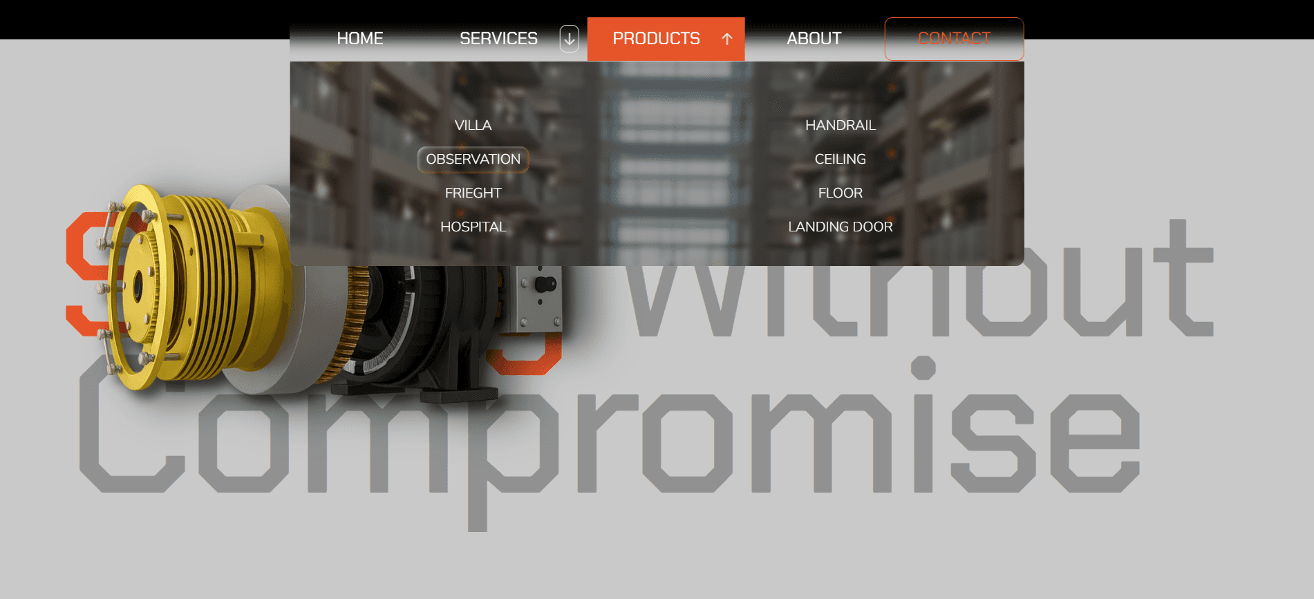
Drop Down Menu (Products)
Drop Down Menu (Products)
Drop Down Menu (Products)

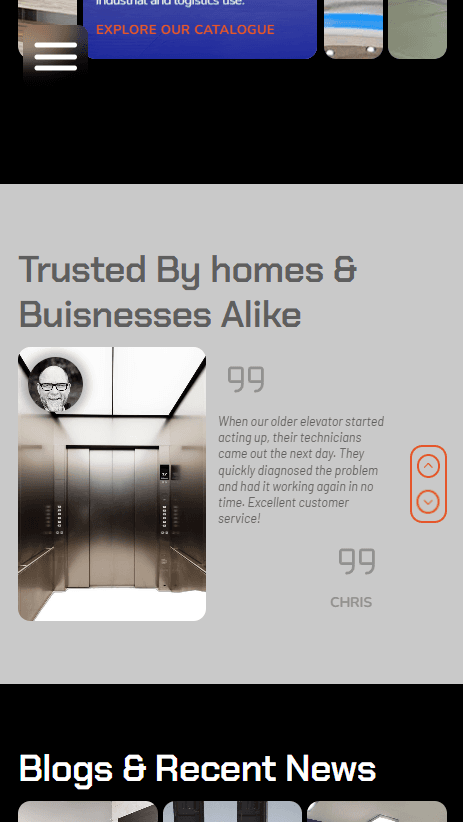
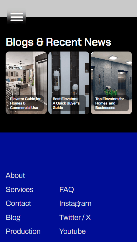
03. MOBILE ADAPTIVE
03. MOBILE ADAPTIVE
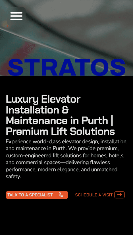
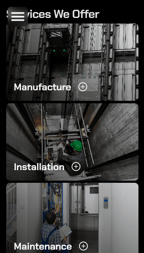
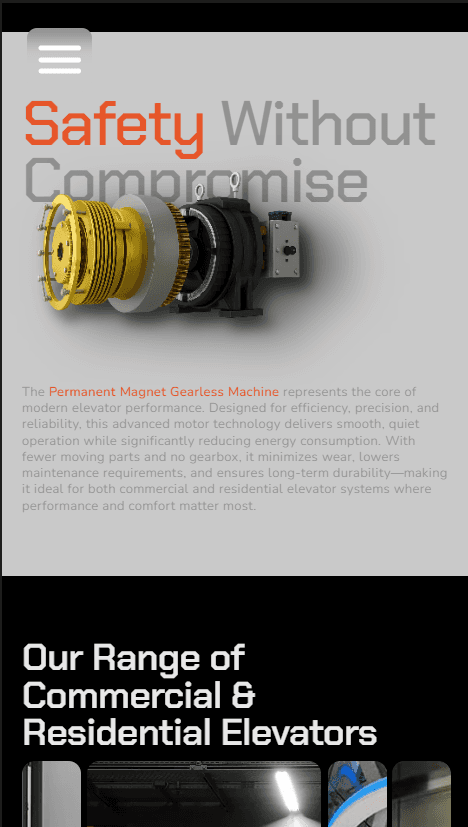
03. MOBILE ADAPTIVE


Made with Framer
Made with Framer
Made with Framer
More Projects
More Projects
More Projects

